Product Design—
3. New Meal Occassions
I worked with a team to introduce new meal occasions. We wanted to enrich the way people ate by providing Plated recipes for more meals throughout the day.
Design, UI/UX, user flows, cross-platform experience, user research, market research, business metrics, content strategy, cross-functional collaboration.
Product Manager: Tyler Smith
Project Manager: Laura Pellegrino
Engineering Manager: Judah Anthony
Engineers: Chris Lee, Chris Schalago, Alex Deschamps
iOS Engineers: Nick LoBue, Dan Hassan
Android Engineer: Charlie Christensen
Senior Product Designer: Justin Pierce
Product Designer: 👋️
Data Science: Barbara Stekas
Data Analyst: Lisa Yau
Copy Director: Alicia Berbenick
Marketing: Francesca Vaccari, Philippia Vaastra
Culinary: Andrea Folkerts, Michelle Kresch
Operations: Dale Trigger, Corbin DiGianni
Sourcing: Devika Kumar
Overview
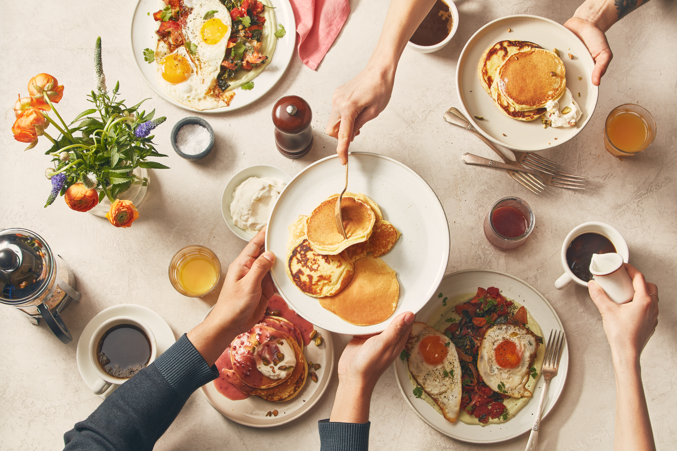
At Plated, a subscription meal kit company, we only offered dinner options. In an effort to innovate our product, our team launched multiple initiatives: Brunch, Protein Upgrades, Appetizers and Sides, over the course of two quarters. Our business goal was to increase our average order value (AOV) by 2.7% in that 6-month time frame. This case study is focused on our Brunch initiative, as it was our first initiative, and it created the learnings and framework for those that followed.
Opportunity
Innovate our product line with meal occasions outside of dinner. “Breakfast” was an opportunity that none of our competitors were offering.
Goal
Create a “breakfast” add-on for users. Discover demand for the new product and figure out the operations and experiences necessary to scale our new product nationally.
Hypothesis
Users have a desire to cook with Plated for more meals throughout their day. A “breakfast” option would allow our users to start and end the day with Plated.
Research
Knowing that we wanted to start our new product initiatives with the introduction of breakfast, we worked with our parent company, Albertsons, and used their customer database to find some initial learnings.


We used the Jobs-to-be-done (JTBD) framework in the next step of our research process. The senior designer and I worked together to interview 9 users over the phone about breakfast/brunch.

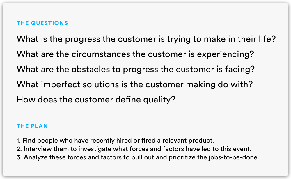


The interviews confirmed a lot but also revealed some new information. After these rounds of qualitative research, our team agreed to pursue Brunch as our first initiative. This research was integral in our decision to follow the route of brunch over breakfast. People were willing to enjoy and spend time on their weekend brunches.
User Flows
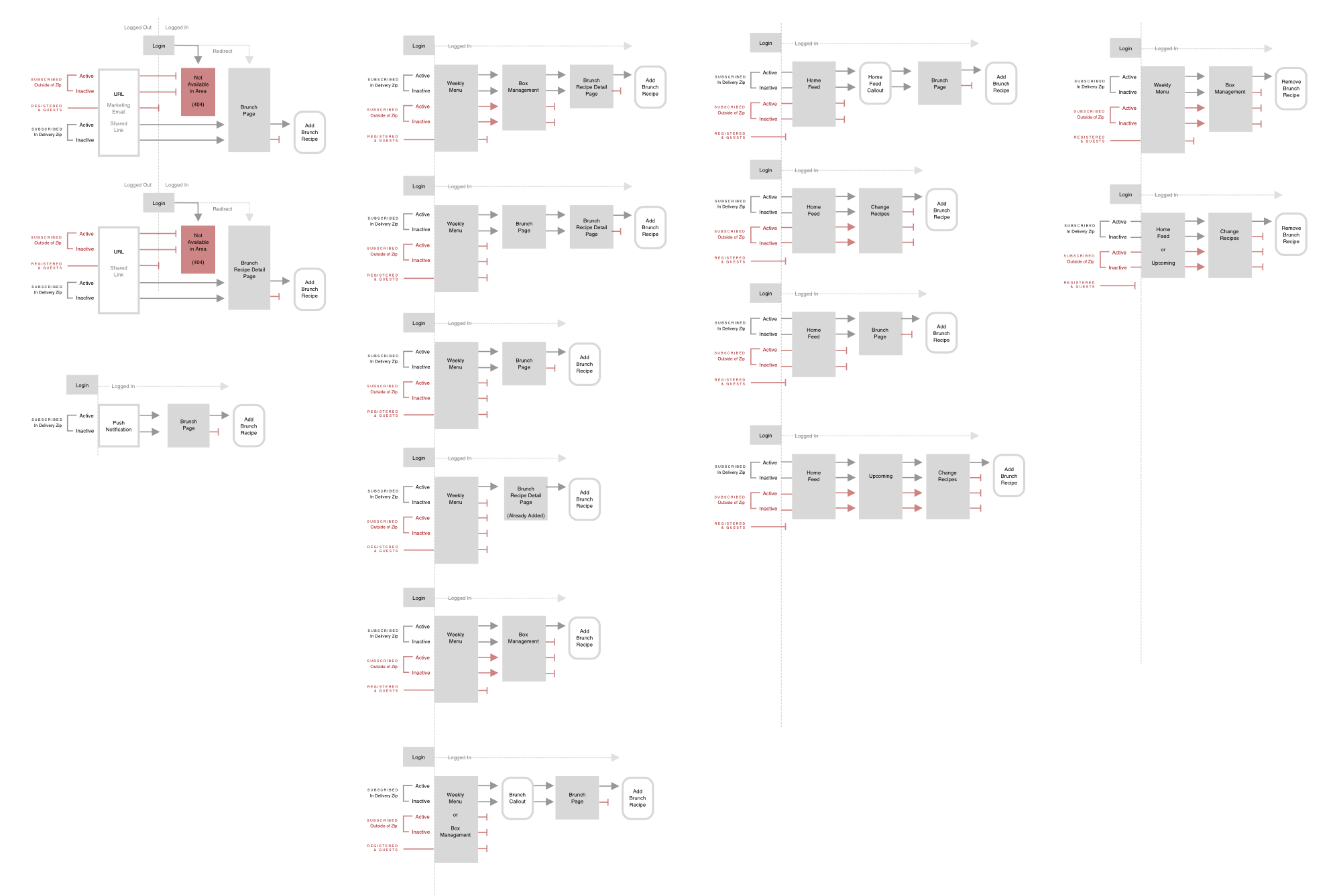
The senior designer and myself worked on the userflows. We knew that this was going to be released to customers on all platforms, so we had to consider both the web and native flows. Being a subscription service, we also had to consider how the flows would affect active, inactive, and new users.
We were introducing a behavior where users could add food to their box from the landing page. This meant we had to consider how this landing page functionality would integrate with our existing add-to-box flow.
Deliverables

Weekly menus
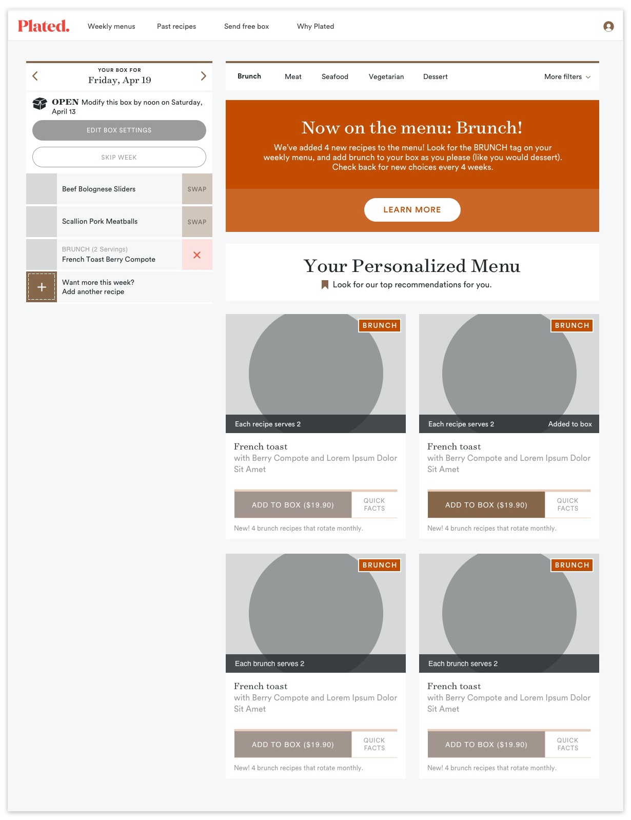
First I created a Brunch call-out on the weekly menus page. The weekly menus page is the landing page for all logged-in, subscribed users. This new call-out linked directly to the Brunch landing page. It was one of the main entry points of access to the Brunch landing page from our user flows.
Box management
The box management page also had a call-out that linked to the Brunch landing page. Here, users added or removed recipes within their box.
We implemented recipe filtering on this page, so we added a Brunch filter to the front of the list.
We added a “BRUNCH” tag to the recipe tiles. We also added a small black bar that showed serving size and provided confirmation when the user added a Brunch recipe to the box.
To be explicit on cost, we included the price in the “Add to box” CTA for Brunch recipes. These recipe tile components were also used on the Brunch landing page.
Native
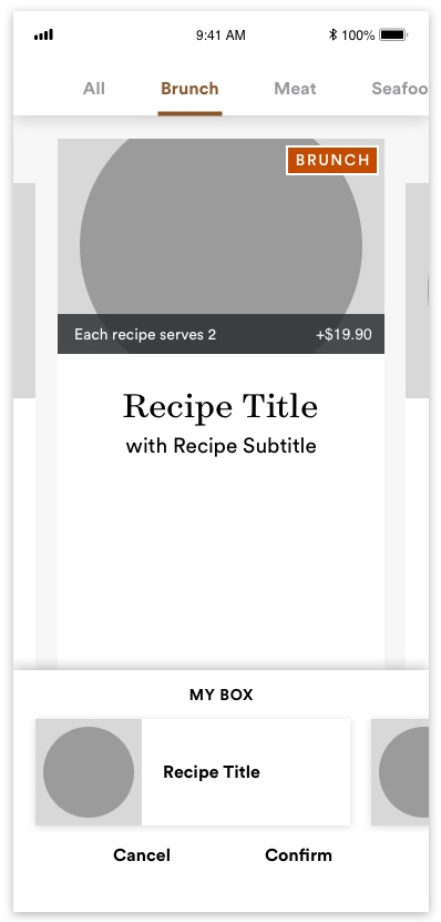
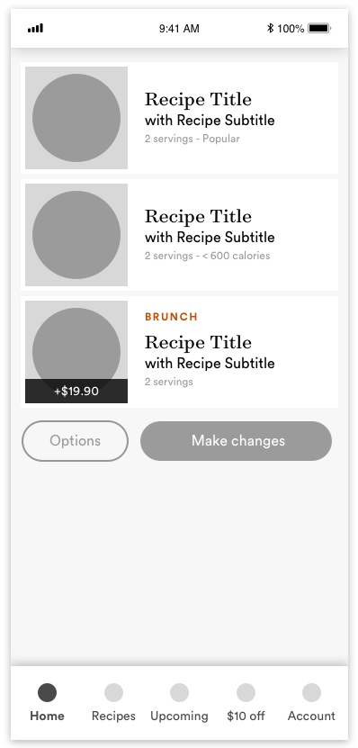
On both iOS and Android, we added the same “BRUNCH” tag to the main native recipe tiles, and included the info bar. The information bar had the serving size and the cost of the Brunch recipe.
We also incorporated the same Brunch filter from the box management page and brought Brunch recipes to the beginning of the recipe browsing section.
When users added a brunch recipe to their box, the smaller recipe “tile” included a modified “BRUNCH” tag with an information bar that provided the price.
Landing Page
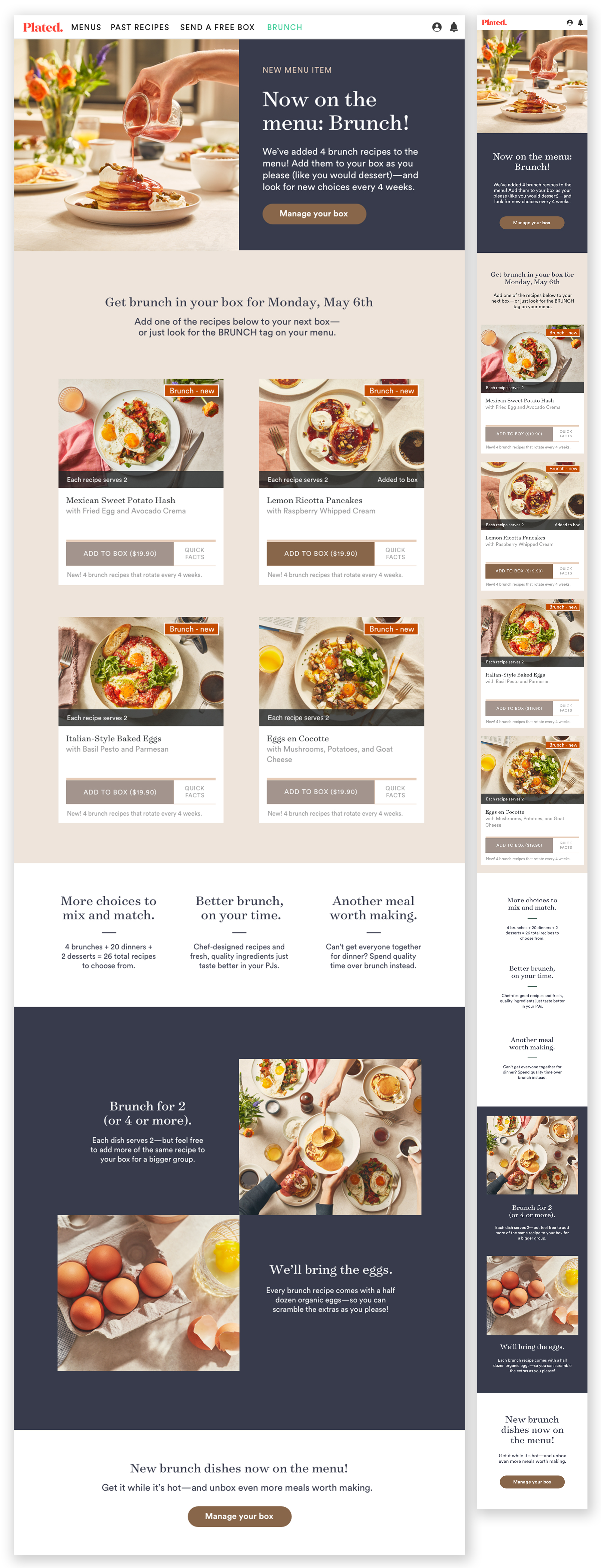
With our tight engineering bandwidth and timelines, our team agreed that it would be most efficient to reuse our existing recipe tile component. The recipe tile always had an image, recipe title, recipe tags, a quick facts interaction, and the capability to add recipes directly to the box.
This decision informed a lot of the design on this page. We started with a hero that introduced the product. The landing page then used the recipe tiles to showcase the 4 weekly Brunch recipes. We included more content to merchandise the product in an effort to provide as much information about the new offering as possible.
Implementation
Brunch was available on the web and our native apps. In order to learn more about the demand, we opted to pilot the experience in the midwest with one of our fulfillment centers. We were also closely tracking which types of brunch recipes were more popular with users. Once we had gained some insights from our 9-week pilot, we decided to scale the offering nationwide.
Pilot
We launched our Brunch pilot to over 10,000 zip codes from our Midwest Fulfillment Center in Chicago. Users were adding recipes to their boxes before we sent out communications to our customers. Over a 9-week period, we had an average of 130 orders a week with a high of 214 orders and a low of 73 orders
Scale
With the success of our pilot, we wanted to expand to as many users as possible. We did a nationwide scale to increase order volume. We expanded from our pilot set of 10,000 users to all ~70,000 of our users. During our first week of scale, we had 932 orders, compared to our pilot average of 130 brunch orders a week.
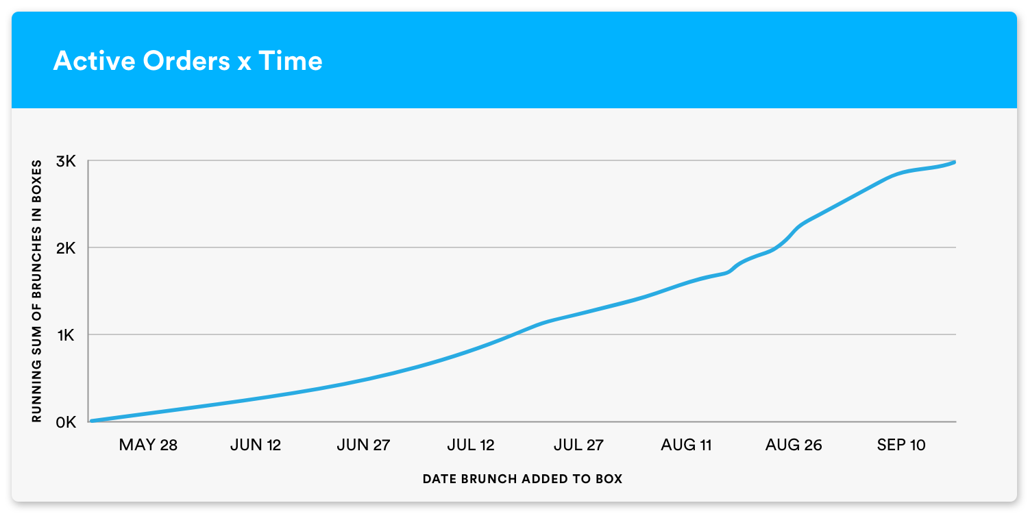
ACTIVE ORDERS x TIME
We saw a steady increase week after week on brunches being ordered. We had the largest increase when we scaled across the nation.
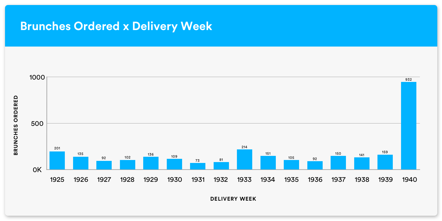
BRUNCHES ORDERED x DELIVERY We had consistent orders until we scaled the offering from one fulfillment center to across the nation. The demand had traction and the increase in orders grew with the increase of customers we made the offering available to.

TOP SELLING RECIPES There was a variety of sweet and savory recipes that became our most popular, but a sweet recipe of Pumpkin Pancakes championed the favorites.
User Behavior
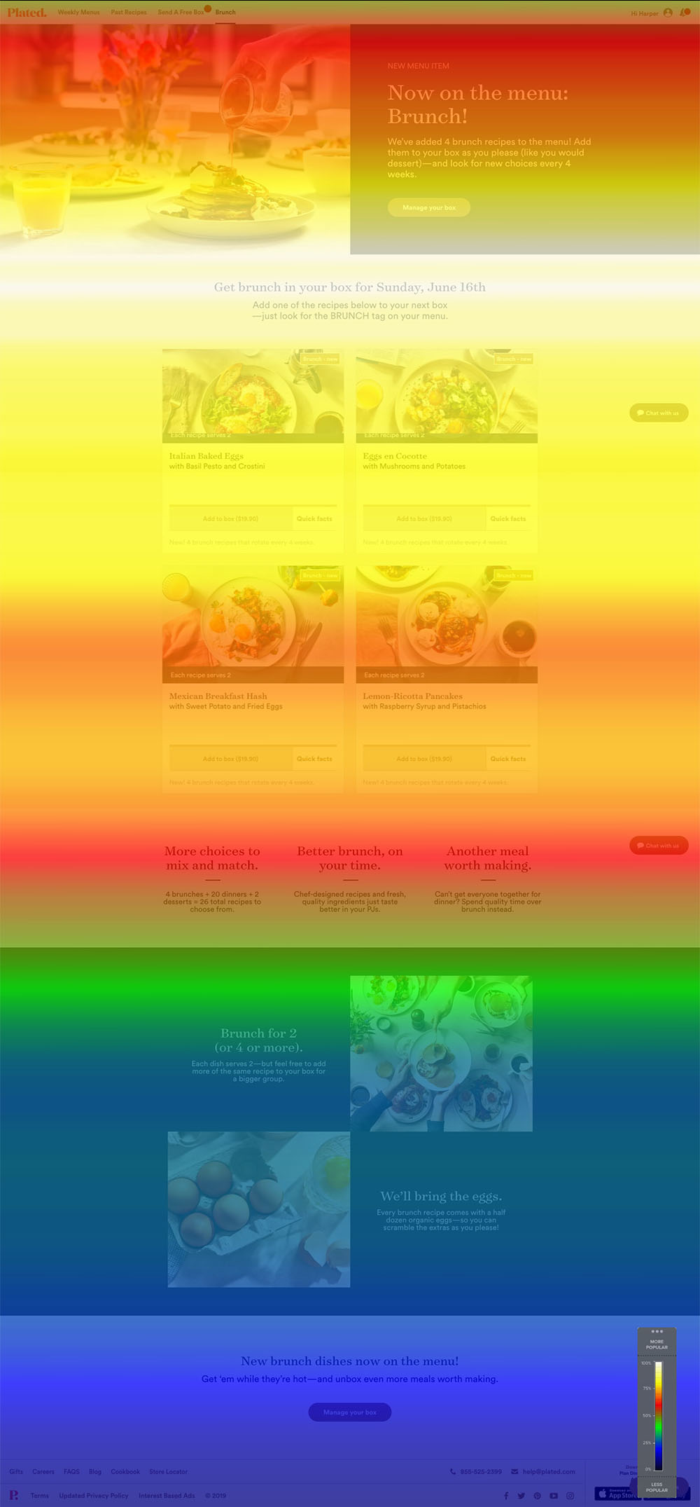 Scroll Map—Desktop
Users were spending the most time in the area that they could order the brunches. Not very many users utilized the whole landing page.
 Confetti Click Map—by device
Users were mostly going directly to manage their box. They were also clicking into the recipe tile. They were also clicking directly into the recipe images. Of 1362 sessions, 730 were on desktop, 515 were accessing the experience on their phones, and 117 users were on a tablet.
Learnings
Brunch was an interesting endeavor that required a lot of effort from all teams.
Culinary was testing new recipes. Operations and Sourcing had to figure out how we could add these recipes to the box and how to ship eggs for the first time. Our marketing partners were making sure communications were accurate and on-time while working with us on gathering market research. The Creative team worked to create our visual assets. Our Data team built new models and tracked new events and behaviors, all while keeping us up to date on our most recent numbers. The product manager was orchestrating timelines and test plans to launch 4 new products in a 6 month period. The senior designer and I had the challenge of working against incurred design debt and finding a way to piece together a new experience within our old design system. The engineers were working against incurred engineering debt, too, and had to work with us across all platforms to get a structure in place for introducing new products into an old system. We had to do all of this—and do it fast.
This project taught me a lot about foresight and how to create experiences that can be extendable—two things I wished I had spent more time on during Brunch. I believe we could’ve had a more impactful experience in our other initiatives. It also put me in a new position of heightened responsibility. Together with all the integral team members, we had to improve communication and understand how to help each other throughout the process.
Overall, thanks to all four initiatives, we reached our AOV goal and successfully launched four new products that customers grew to love.
Brunch
SALES TO-DATE (11/13)
8,104
REVENUE TO DATE (11/13)
$137,329.90
REVENUE RUN RATE
$955,200.00
TAKE RATE
~3%
SALES TO-DATE (11/13)
8,104
REVENUE TO DATE (11/13)
$137,329.90
REVENUE RUN RATE
$955,200.00
TAKE RATE
~3%
Protein Upgrades
SALES TO-DATE (11/13)
33,178
REVENUE TO-DATE (11/13)
$169,873.66
REVENUE RUN-RATE
$1,454,330.27
TAKE RATE (BOX LEVEL)
~10%
SALES TO-DATE (11/13)
33,178
REVENUE TO-DATE (11/13)
$169,873.66
REVENUE RUN-RATE
$1,454,330.27
TAKE RATE (BOX LEVEL)
~10%
Appetizers
SALES TO-DATE (11/13)
3,930
REVENUE TO-DATE (11/13)
$29,292.00
REVENUE RUN-RATE
$672,000.00
TAKE RATE (BOX LEVEL)
~3.5%
SALES TO-DATE (11/13)
3,930
REVENUE TO-DATE (11/13)
$29,292.00
REVENUE RUN-RATE
$672,000.00
TAKE RATE (BOX LEVEL)
~3.5%
Sides
SALES TO-DATE (11/13)
3,736
REVENUE TO-DATE (11/13)
$23,091.60
REVENUE RUN-RATE
$504,000.00
TAKE RATE (BOX LEVEL)
~3.5%
SALES TO-DATE (11/13)
3,736
REVENUE TO-DATE (11/13)
$23,091.60
REVENUE RUN-RATE
$504,000.00
TAKE RATE (BOX LEVEL)
~3.5%