Product Design—
2. Holiday Bundles
I created a custom landing page experience that merchandised holiday-specific products.
Cross-functional collaboration, user flows, UI/UX, responsive web design, content strategy, user behavior tracking, data and business metrics.
Product Manager: Helen Piquet
Engineers: Lin Yang, Paris Yee
Product Designer: 👋️
Data Analyst: Matt Stone
Graphic Designer: Sam Stone
Copy Director: Alicia Berbenick
Art Director: Aica Domingo
Executive Creative Director: Clayton Perryman
Photography: Ashley Schleeper, Maeve Sheridan
Studio Producer: Nadya Grace
Project Manager: Andrea DeFrancis
Marketing: Philippia Vaarstra
Culinary: Rachael Stuart, Andrea Folkers, Michelle Kresch

Problem
At Plated, a subscription meal kit company, our business metrics from the previous years showed that orders tended to decrease during the holidays. In response, we created holiday-specific solutions for our users.
Goal
Use Thanksgiving as an opportunity to provide two new convenient Thanksgiving dinner options, complete with step-by-step instructions, that are easy to order and easy to make.
Hypothesis
We can maintain—or even increase—order rates during the holidays if we provide a more convenient, curated holiday experience.
Userflows
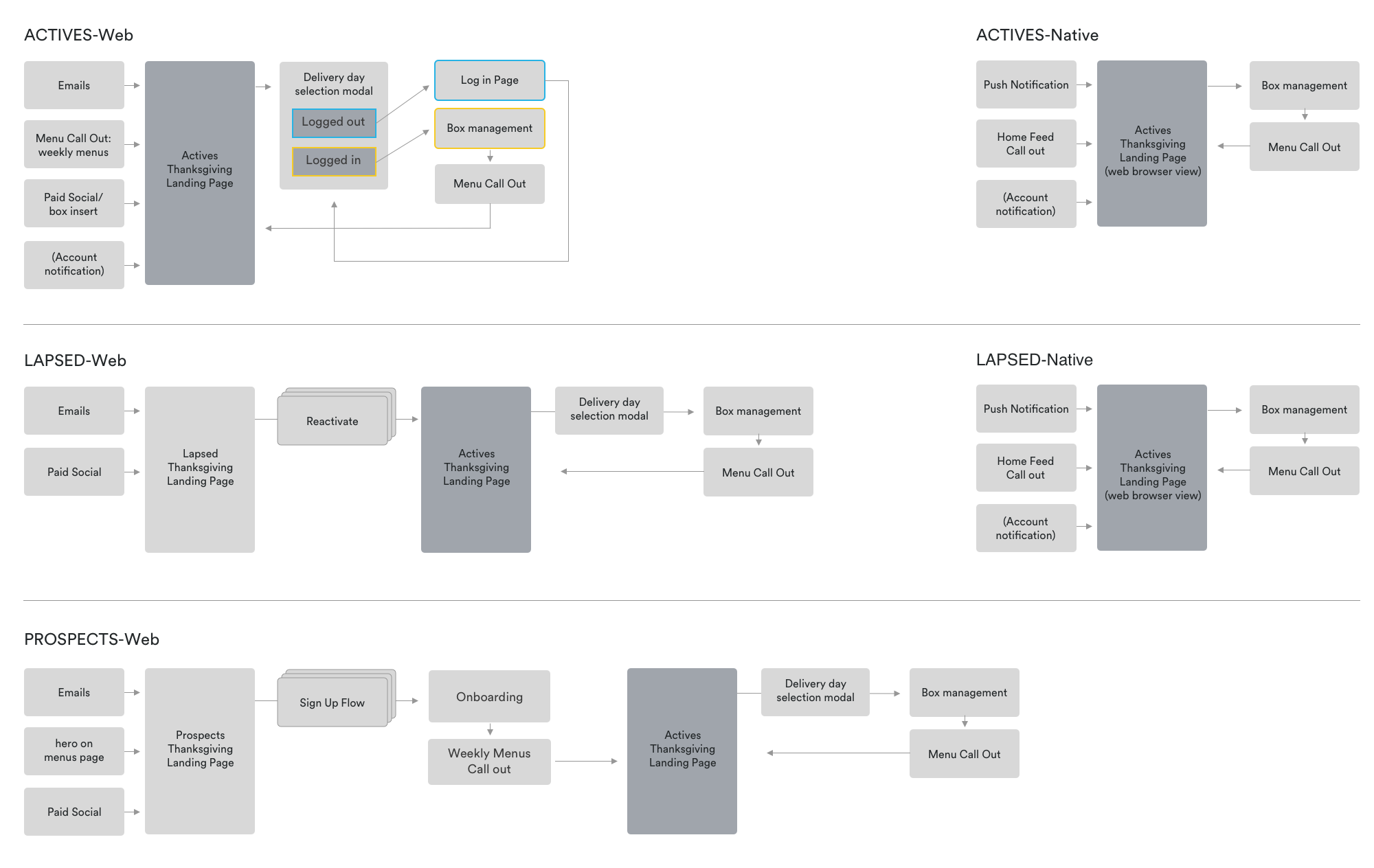
We decided to create a dedicated landing page for two holiday bundles. I worked closely with my PM and our dedicated engineers to devise the user flows. We needed three different flows, because of our three types of customers: active, lapsed, and prospects[1]. We also mapped out native flows for active and lapsed users who may be exposed to this offering through the app. Marketing was working closely with Creative to generate customer touch point assets that would enter users into our flow: email communications, menu page banners, paid social ads, an in-box insert, account notifications, and, for native, a push notification.
[1]
ACTIVE: accounts with an active orders
LAPSED: inactive accounts
PROSPECTS: new customers
ACTIVE: accounts with an active orders
LAPSED: inactive accounts
PROSPECTS: new customers
Explorations


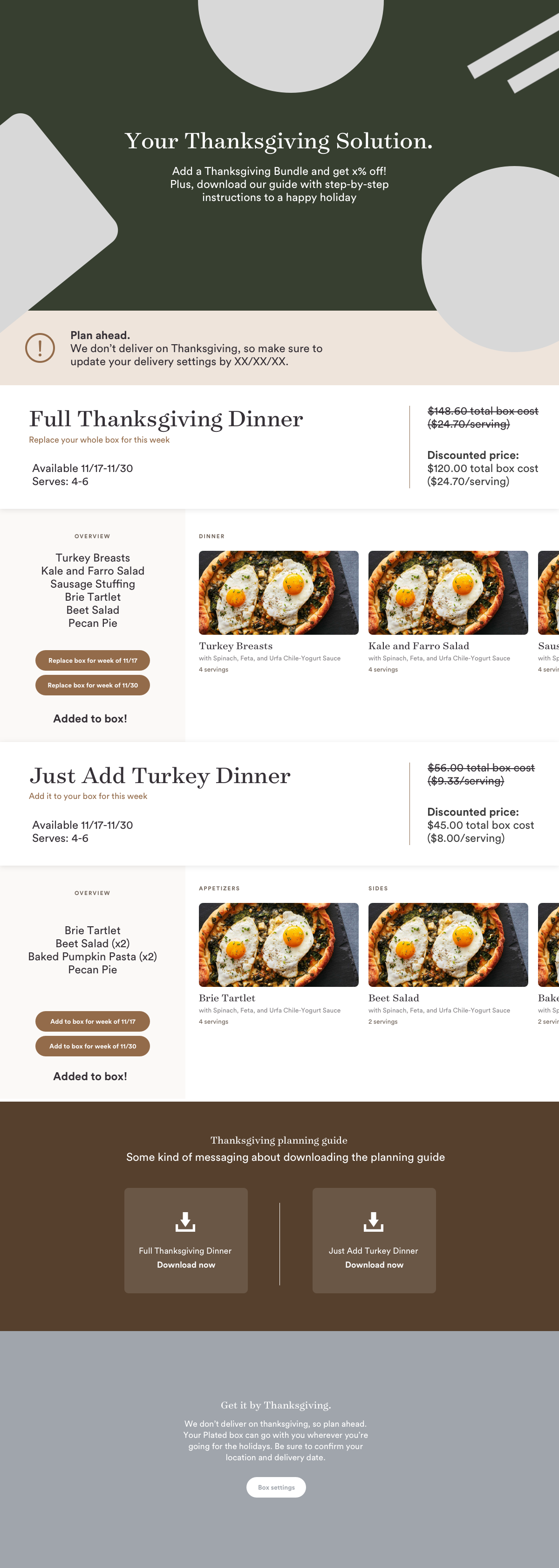
FUTURE PROOF
The approach had to be strategic and systematic. We wanted to maximize our efforts and create an extendable solution for future holidays.
The approach had to be strategic and systematic. We wanted to maximize our efforts and create an extendable solution for future holidays.
SIMILAR BUT DIFFERENT
There were 2 options to choose.
1: “The Full Feast”—a whole Thanksgiving meal that replaced your entire subscription box.
2: “Just The Extras”—appetizers, sides, and desserts that were added to your regular box.
There were 2 options to choose.
1: “The Full Feast”—a whole Thanksgiving meal that replaced your entire subscription box.
2: “Just The Extras”—appetizers, sides, and desserts that were added to your regular box.
COMPLICATED OPERATIONS
Adding/removing a “bundle” of recipes introduced complications because our existing platform was designed for adding and removing one recipe at a time.
Adding/removing a “bundle” of recipes introduced complications because our existing platform was designed for adding and removing one recipe at a time.
A LOT TO DISTILL
With a lot of information (price, recipes, servings, offers, etc.) this experience had to be clear without overwhelming our users. We also had to introduce the concept of adding bundles of recipes to a box from this landing page.
With a lot of information (price, recipes, servings, offers, etc.) this experience had to be clear without overwhelming our users. We also had to introduce the concept of adding bundles of recipes to a box from this landing page.
Solution
Interaction
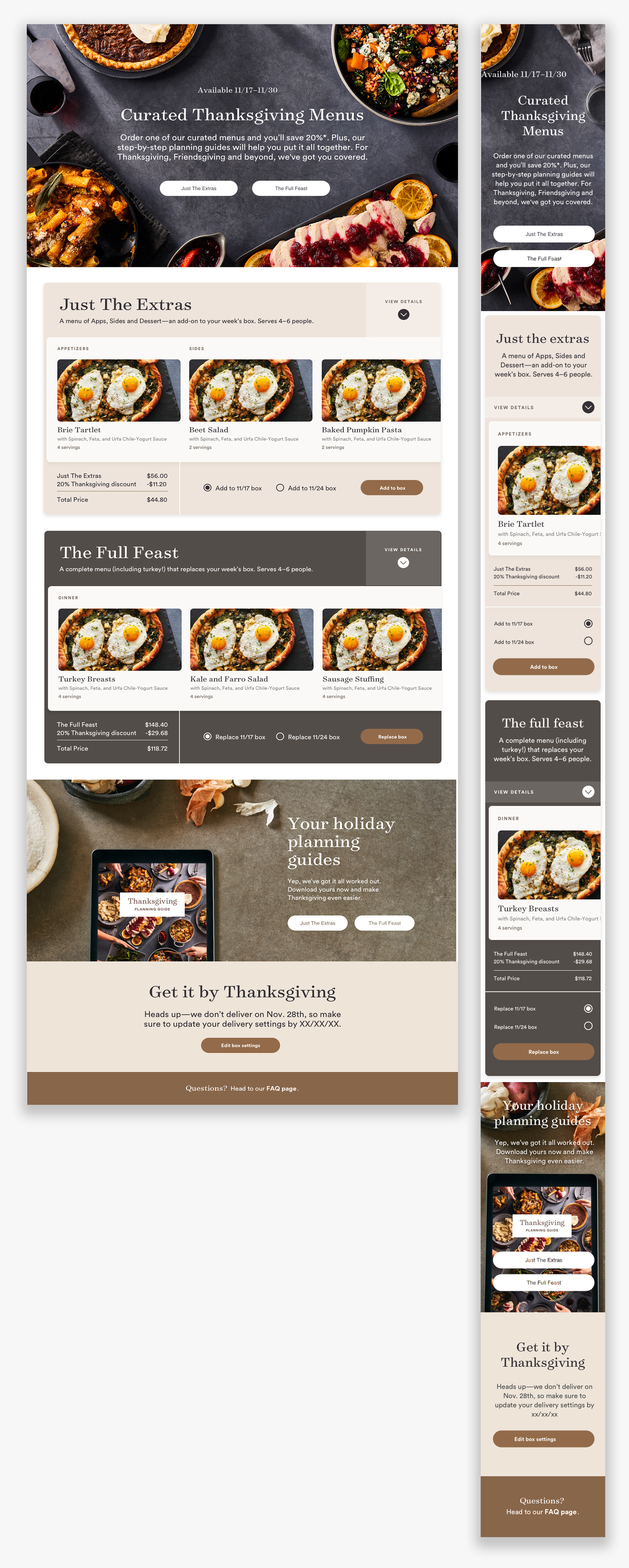
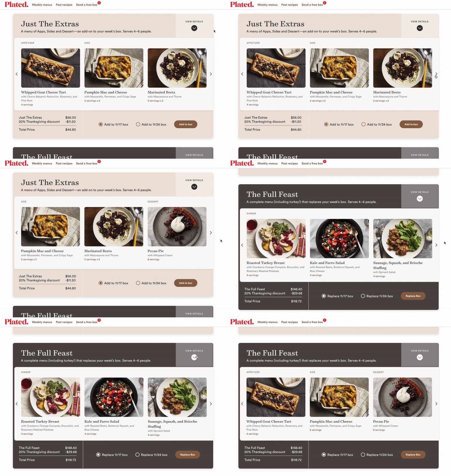
After composing the general layout of the page, I focused on the “browse” and “purchase” interactions. My intent was to have users spend the most time exploring the recipes. The card-like containers helped differentiate the products while providing a sense of tangibility. The recipe photo carousel became the focal point for both products. To supplement the carousel, there’s an expandable drawer that lists out the menu items for each bundle—allowing the user to quickly assess the contents of each one. After many iterations and rounds of feedback, I was able to lean on our new design system to help make decisions on the remaining details.
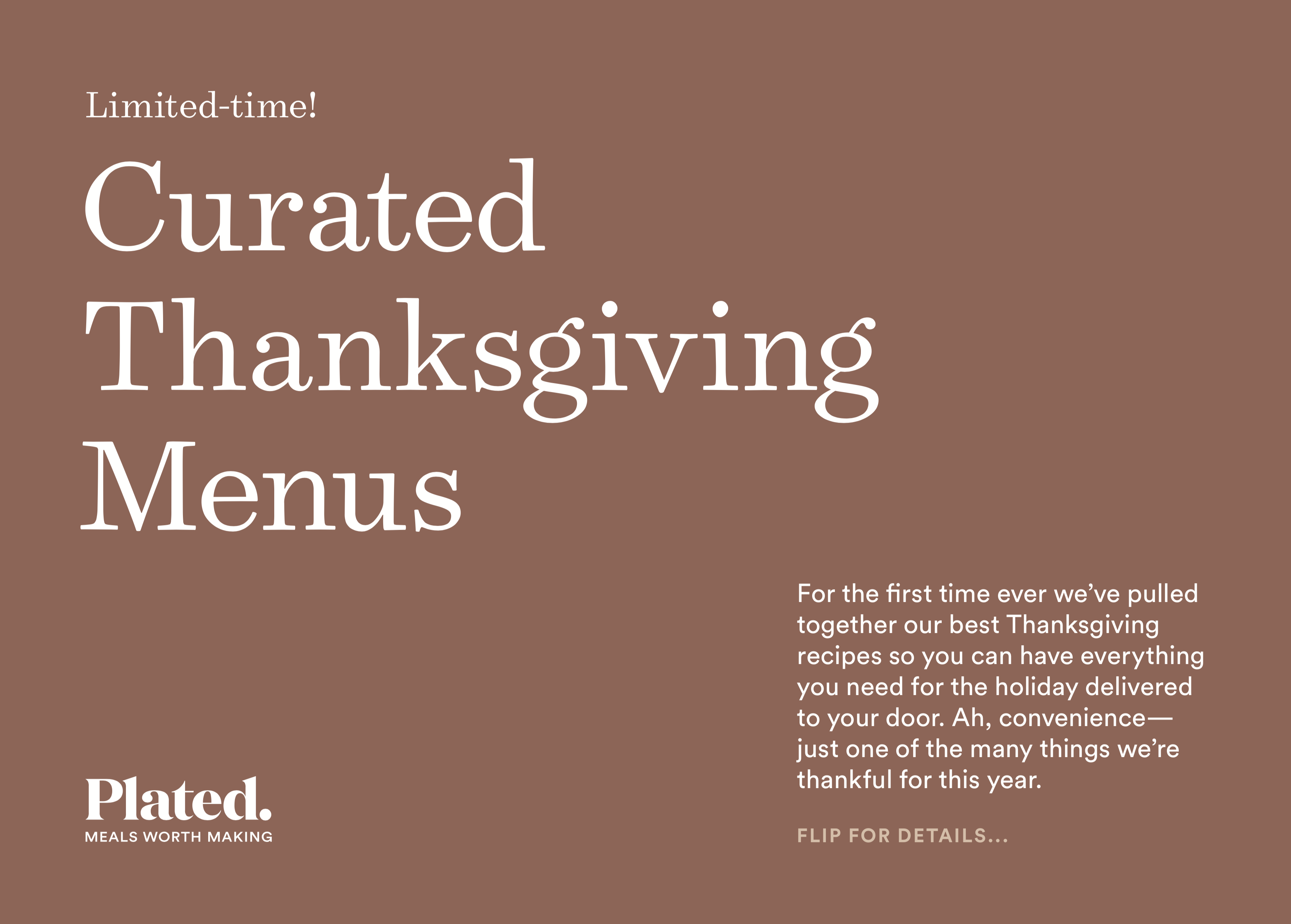
Customer touch points
BOX INSERT


User behavior
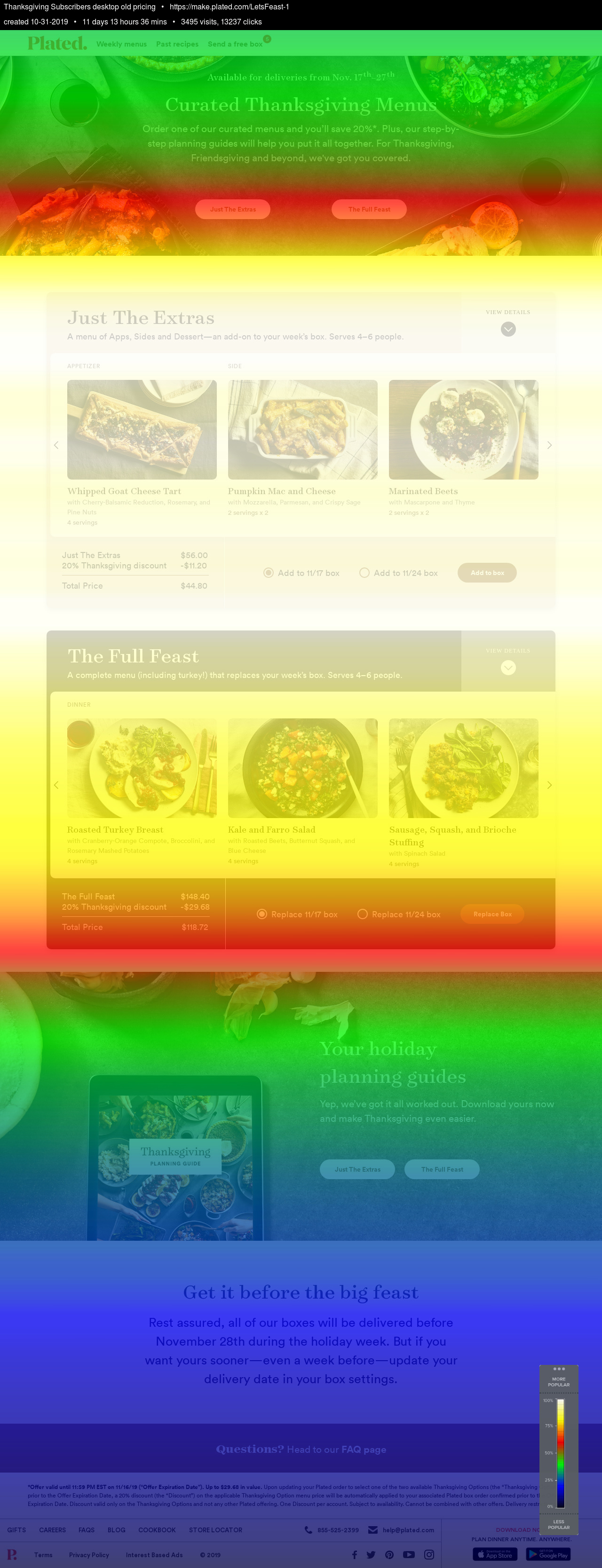
 Heat Map—Desktop
Users seem to be interacting slightly more frequently with “The Full Feast” option. The hot spots show that both carousels are being utilized by our users. There is also a fair amount of activity on the expanding details menu for both options.
Scroll Map—Desktop
The users are most focused on the product options, with little to no utilization of the bottom of the page. “Just The Extras” section has a bit more scroll activity, but this could be due to the fact that it’s closer to the fold.
 In-Box Count by Delivery Schedule (DS)
Between the two available delivery days for this offer, DS 1948 (the week closer to Thanksgiving) was significantly more popular for users who purchased “The Full Feast.” There is an increase in the same DS for the “Just the Extras” customers, but overall users were more frequently purchasing “The Full Feast” option.
 Orders by (Servings x Night) Plans and Delivery Schedule (DS)
 We can see that DS 1948 brought in a few acquisitions via both offerings. Most customers who ordered, were on the 3x2 (servings x nights) plan for both offerings. The 2x2 plan “Full Feast” customers for DS 1948 ordered slightly more than the highest order rate for the “Just the Extras” option.
Learnings
When I started working on this, I noticed “The Full Feast” price was nearly three times as much as the other option and was curious to see how it would perform. In spite of the cost, it out-performed “Just the Extras”—seeming to confirm that we successfully provided a convenient solution for our users.
Due to this project’s quick turnaround, we had to deprioritize user testing. If we’d had the time, we could’ve had a better understanding of what information people needed, and it could have given us some insight into customer interest. Knowing these insights could have solved a lot of the hierarchy issues.
