Product Design—
1. Family Servings
I created a homepage interaction that helped us target families and taught us more about our customers.
Content strategy, research, wireframing, prototyping, user testing, UI/UX, visual design, data and business metrics.
Content strategy, research, wireframing, prototyping, user testing, UI/UX, visual design, data and business metrics.
Director of Product Design: Harper Lieblich
Executive Creative Director: Clayton Perryman
Product Manager: Rukmini Mahurkar
Data Analyst: Helene Piquet
Product Designer: 👋️
Graphic Designer: 👋️
Copy Director: Alicia Berbenick
Executive Creative Director: Clayton Perryman
Product Manager: Rukmini Mahurkar
Data Analyst: Helene Piquet
Product Designer: 👋️
Graphic Designer: 👋️
Copy Director: Alicia Berbenick
Opportunity
At Plated, a subscription meal kit company, our most popular customer was ordering the 2 servings x 2 nights plan. We wanted to increase sales and business value by targeting prospects[1] who would order larger serving sizes.
[1]
PROSPECTS: new customers
Goal
Showcase the flexibility of our plans with a focus on families in order to increase plan sizes and conversion.
Hypothesis
If we could personalize our homepage to prioritize the needs of families, then higher serving-size customers would be more likely to subscribe.
Initial sketches
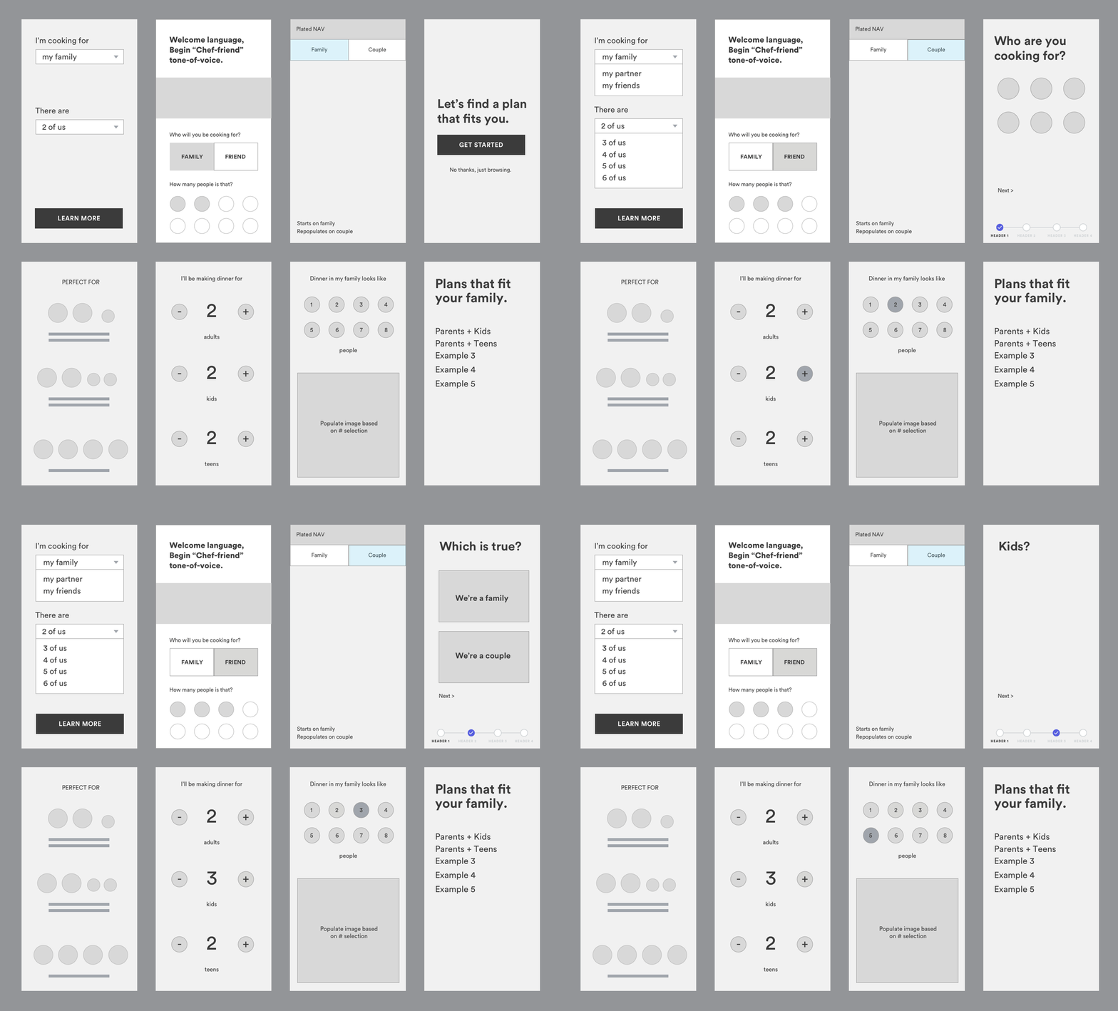
My initial approach to this project was to allow users to toggle between a “family” version vs a “non-family” version of the homepage. Through my explorations, I realized that no two families are the same and wanted to create an experience to reflect those findings. I started working through a variety of paradigms that were more personalized, using data inputs to streamline the sign-up flow process.
Prototyping
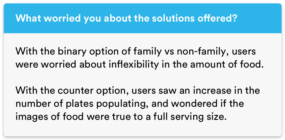
I synthesized my explorations and set up two prototypes for usability testing and research. At this stage, I had a rough idea of the content strategy and simply swapped in placeholder imagery that changed with the user’s selections. I was looking to see which experience users preferred and how either of the experiences could fit their needs.
Prototype 1—Left
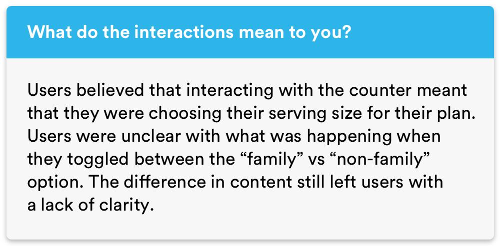
The user could toggle between a “family” and “non-family” option and it would populate the respective content.Prototype 2—Right
The user could select how many people were in their family.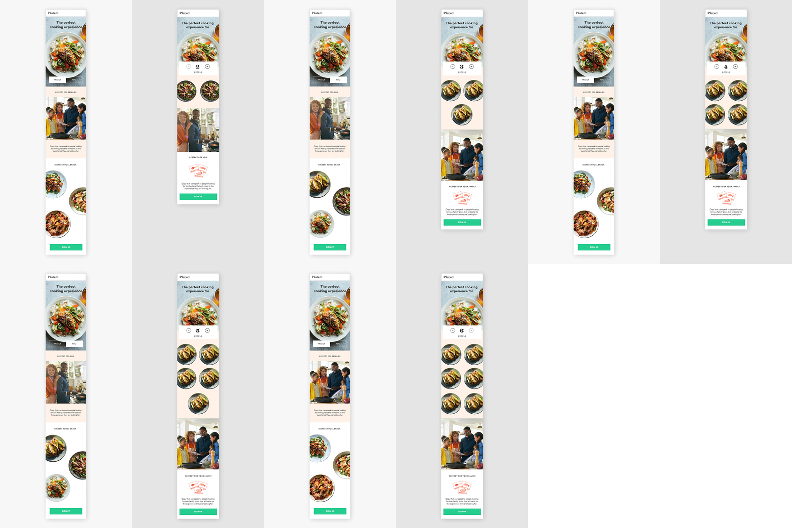
User research
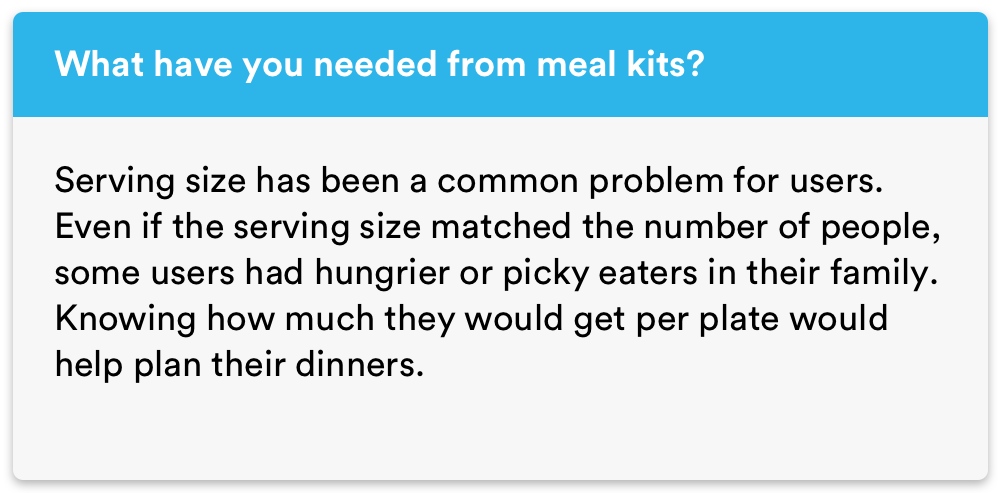
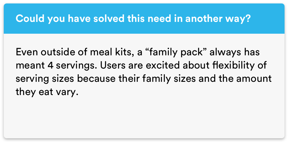
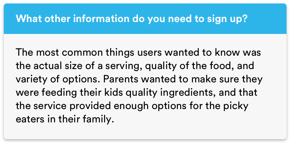
Using a hybrid method of the “Jobs-to-be-done (JTBD)” framework and general usability questions, I conducted research amongst 10 users. The JTBD framework would help me understand user needs and emotional triggers. The general usability questions would help me assess their response to the experiences.
The population criteria included people with families who were actively using (or have tried) other meal kits.
I chose this population for a number of reasons. These users would already have context about meal kits, allowing me to ask about the “jobs” meal kits were performing in their lives. Because conversion was an important metric, I sought users who had not yet experienced Plated. I wanted to learn more about the problems that these families faced when cooking with meal kits. I also wanted to gain insights on whether or not competitors and other solutions were better fitting their needs.

Solution
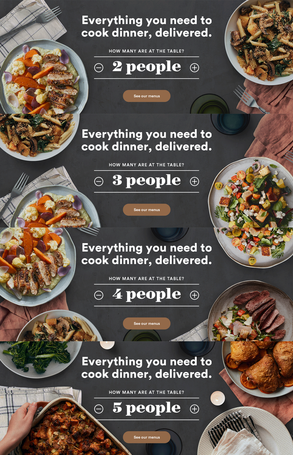
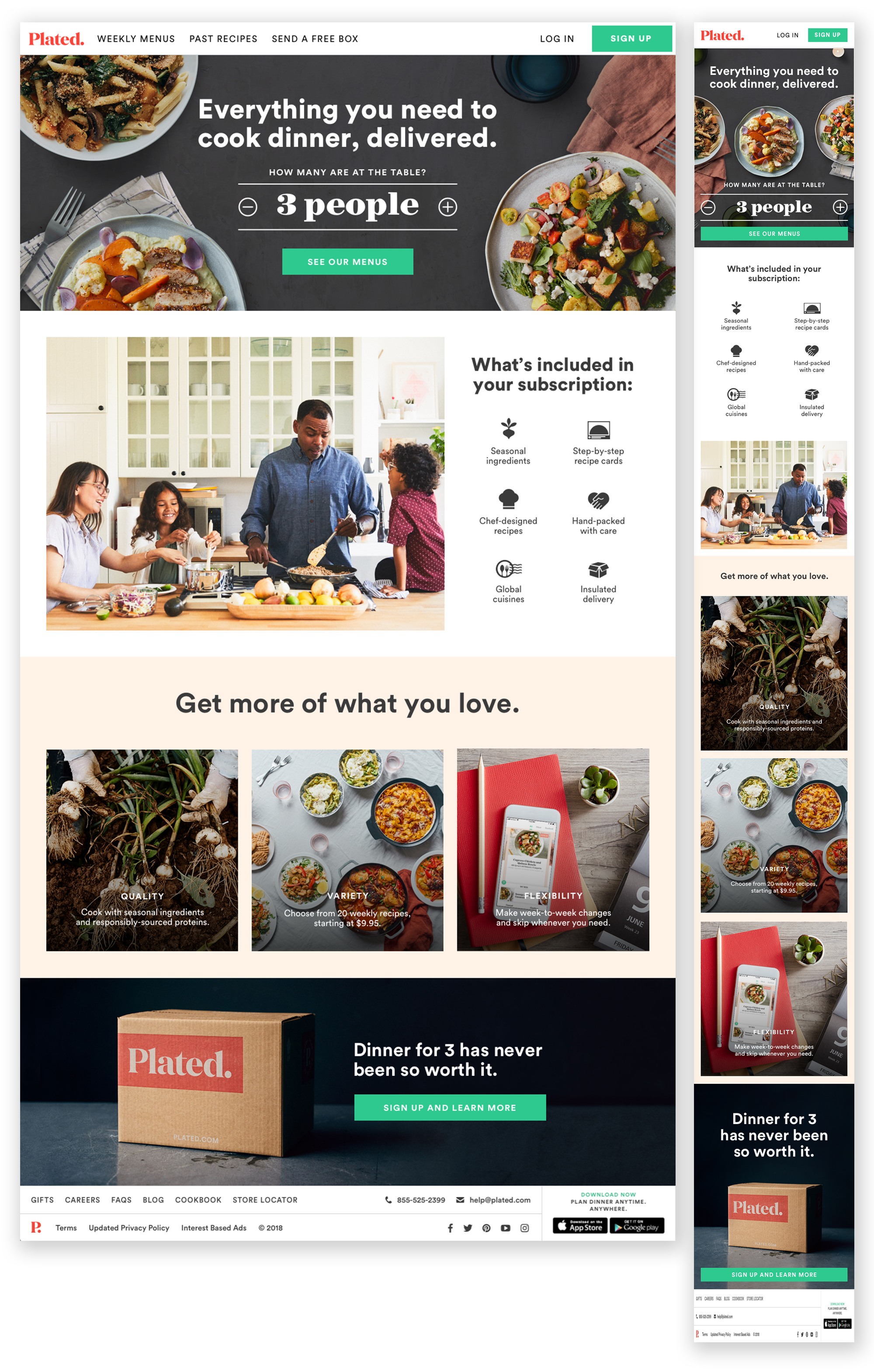
Using my research, I created an MVP version of a new home page. I moved forward with the counter, as users felt it was a more personalized, exciting experience. The content reflected the quality, variety, and flexibility of information that users requested during my research.
We started the counter on “3 people” to feature this serving size. Even though our plans page only allowed users to choose between 2-, 3-, and 4-servings, this counter ranged from 1 person to 8 people. If the user had selected an existing plan option, we pre-selected that plan for the rest of their sign-up process. We were able to accommodate users looking for 5+ serving sizes.
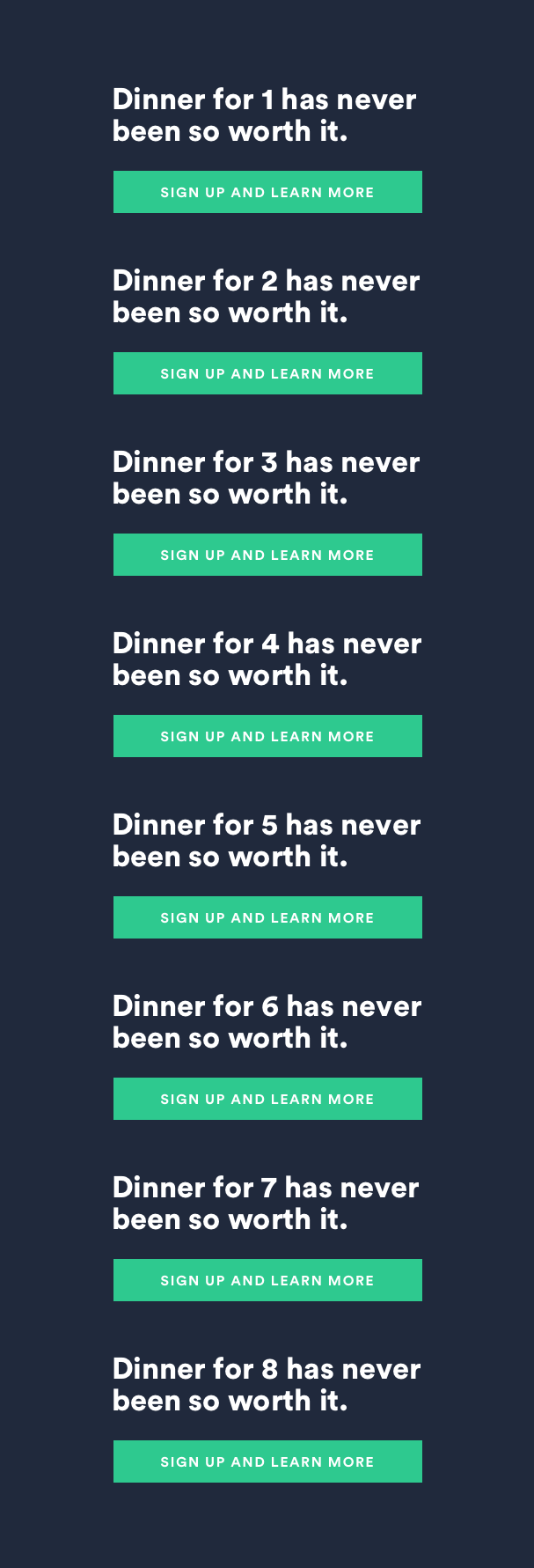
We also used the counter to track demand for different serving sizes. The footer was dynamic and changed with their selected serving size.
Documentation
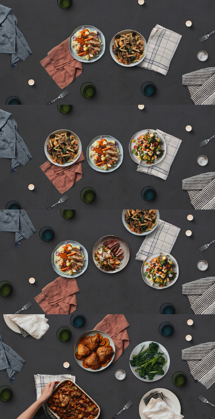
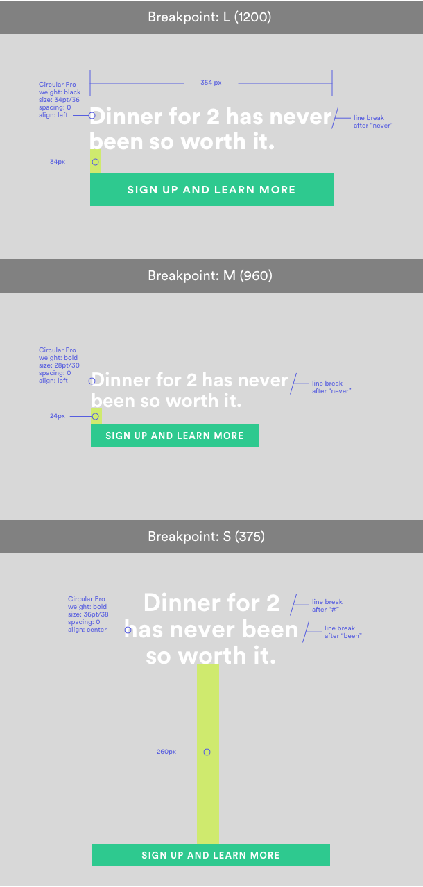
Due to the quick turnaround of this project, I used my experience as a graphic designer to create the visual assets necessary for desktop and mobile. The interaction would populate dynamic assets based on the number of chosen servings.



Test plan
Once the home page experience reached an MVP state, our data analyst and product manager created a test plan before rolling out the family toggle experience to 100% of our users. To more accurately measure the test’s performance, we opted to only use the header from the MVP design. The rest of the homepage remained the same.

CONTROL GROUP:
50% traffic of prospects[1] to the “old” homepage. ~20k sessions.
TEST GROUP:
50% traffic of prospects[1] to the “family servings” homepage. ~20k sessions.
PRIMARY METRIC:
Acquisition conversion rate (CVR)
Expected impact: Test page should have no impact, or a positive impact on Acquisition CVR.
SECONDARY METRIC:
Serving size increase
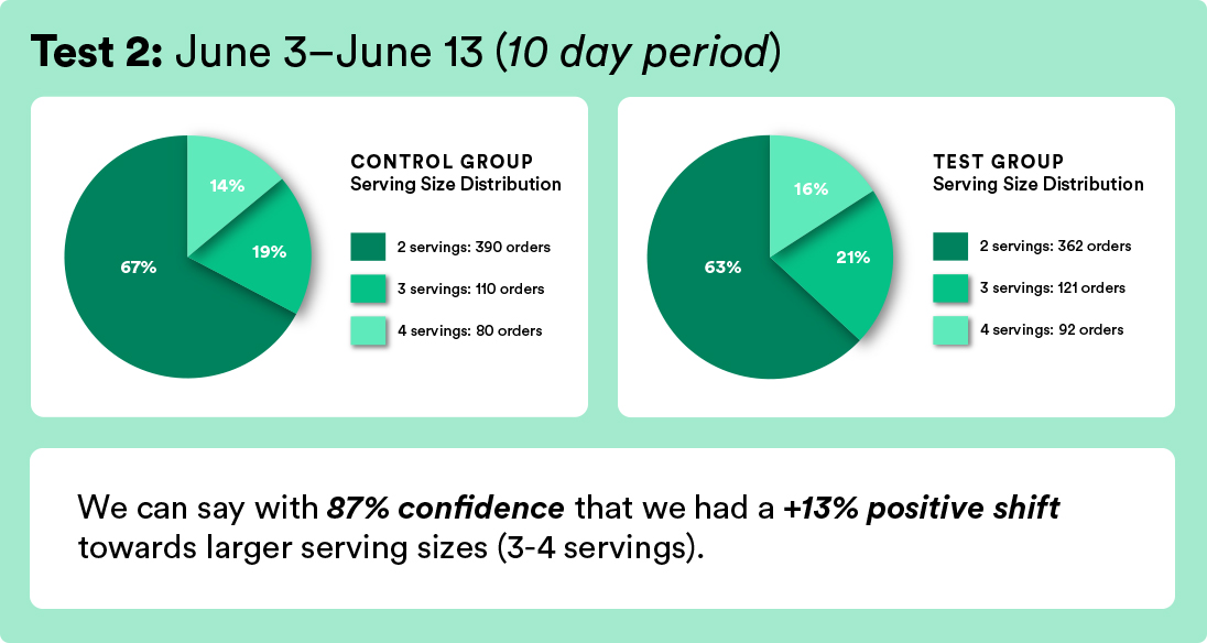
Expected impact: Relative increase in the proportion of 3 or 4 serving acquisition in comparison to the control.
DECISION MAKING CRITERIA:
If statistically significant increase or no negative impact on primary metric, then roll out the test experience 100%.
If statistically significant increase or no negative impact on secondary metric, then roll out the test experience 100%.
If no significant increase in either metrics, then do not roll out experience.
Analysis
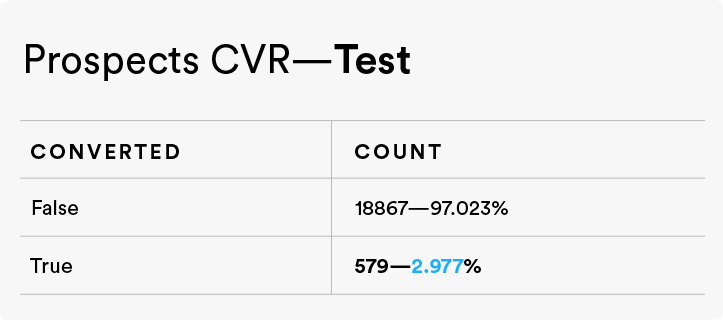
Primary Metric—Acquisition CVR
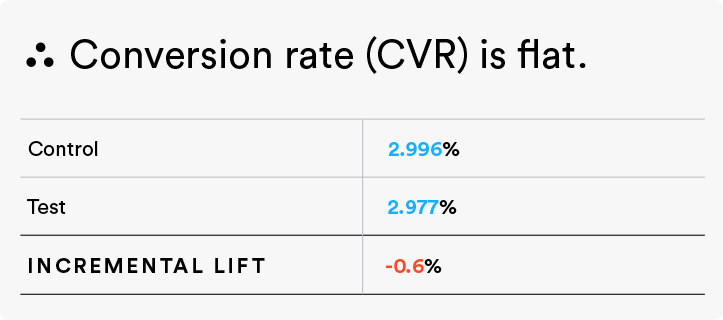
This test had no negative impact on our primary metric.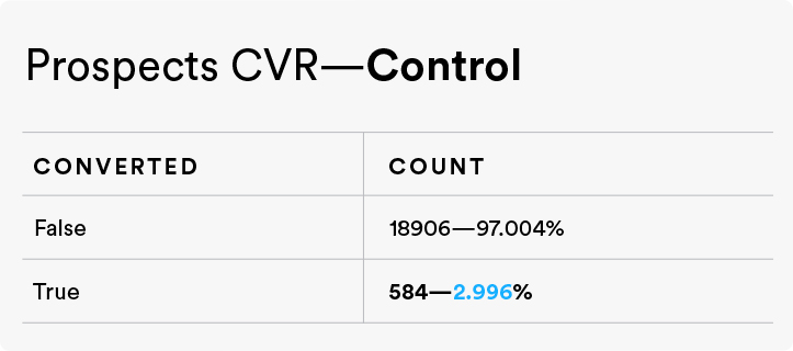
Secondary Metric—Serving size increase
This test had a statistically significant increase on our secondary metric.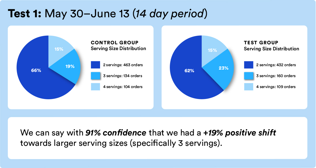
Summary
Based on the decision-making criteria in our test plan, the results from both metrics helped us to decide to roll out the family toggle experience to 100% of Prospects[1].Learnings
We learned more about our users tolerance to dynamic content. This gave the product and creative teams more room to plan for personalized dynamic content in the future. From our analytics and research, we gained the insight that showcasing our serving size capabilities did infact shift the type of customer that was converting from a propspect[1] to a new user.
“The family servings” interaction was rolled out to 100% of users. We tried testing the experience as a control against a new direction, but the new direction resulted in a negative impact in conversion while the control remained consistent. We continued to use the “family servings” interaction on our homepage.
Though this test was successful, I would have liked to take our user testing further, asking users different questions and creating more data for our teams.
